
I actually stumbled upon the 'Sower' accidently, and then had a hard time finding where it resides, (Clark Art Institute in MA), especially since he did another 'Sower' some 15 years earlier which is much more famous. I had seen his "Angelus", prints are available from several Catholic sources, but never knew heard of the Millet before. In researching this picture, I came across much more of his work and absolutely love it. My oldest son made the comment (when looking over my shoulder at some Millet's work on French peasant/farm life we found on the internet) the he appreciates it much more now than he would have when we lived in the city a year ago.
Finally, looking at some of posts this past month or so, I realize that I have written, "I will post more about this later...", numerous times, but failed every time in keeping my promise. I am going to try to come through on those promises this week.
Again, thanks for taking the time in giving me your valuable input.
From Bethany, the small holding in Bethune...
Oremus pro invicem! ______________________________________________________
I need your help. I have 2 competing cover concepts for our next book. We need to make a decision. Perhaps a Friday is not the best day to be making this plea with the weekend coming, but....
Taking a nod from this post at People of the Book blog I have decided to test run my covers here at BethuneCatholic.
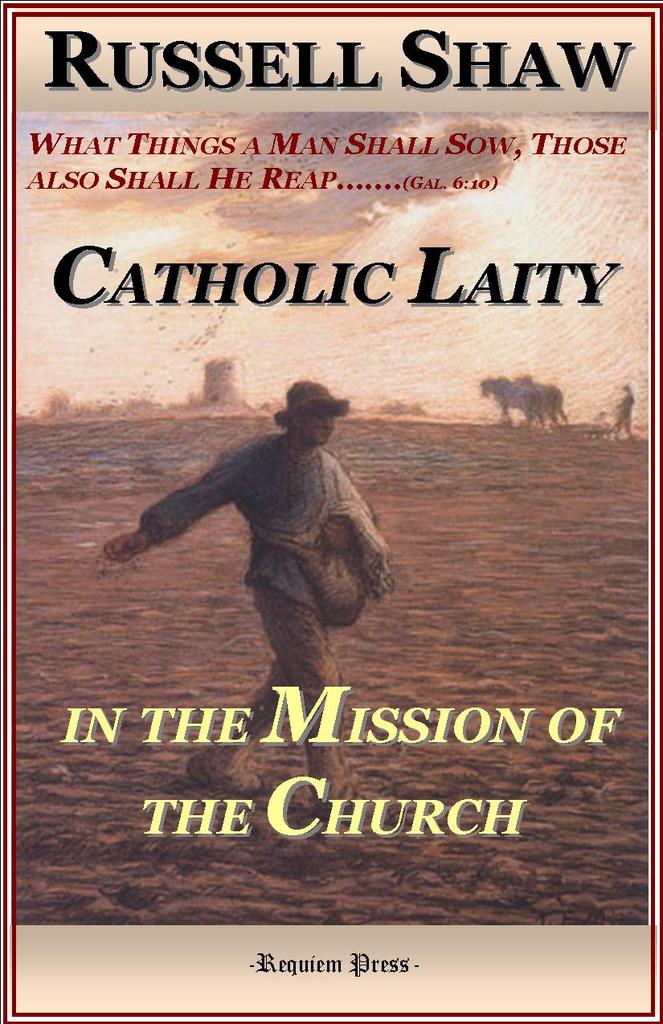
The drawing on Cover A is a draft. The illustration of Cover B is Jean-Francois Millet's 'Sower' [He did three, this is perhaps the last (c. 1860s) of them. His best known work in today's Catholic circles would be "The Angelus". Much of his work was concerned with the life of French peasants.]
A 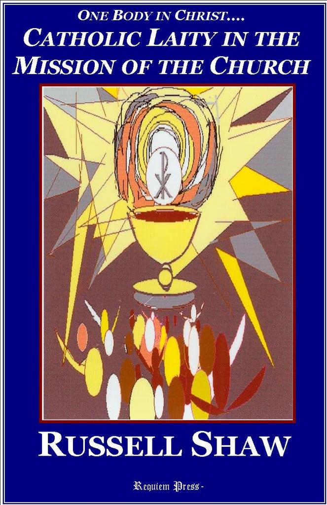 B
B 
Even if you don't like either, please let me know. My threat is good - No more blogging til I get 10 comments on these cover.
Vote away..... (And thanks)


24 comments:
Definitely B.
If I saw cover A on the bookshelf, I would assume it was some crazy book from the early 70s. Cover B is timeless.
I like the second one better.
I agree with the commenters above. I'd do something about the type-face, though.
I agree with Josue Andreas. Cover B evokes all the images of Catholic Culture in Medieval Christendom you could want--but the font, blocky and block-shadowed, appears amateur. Hm, I would definately try eliminating the shadow, and play around with the font. Small caps are cool, as long as the letters looks more "carved Roman" than "circus poster." You could either find a more organic "agrarian" looking font to correspond with the sower theme, or stick with a classy contrast (like the blockish text you have now) that draws attention to the text without being noticable in itself. There is a lot going on in the picture and with the lines of text, so I wouldn't use more than one font (or the plain and italic that you have now).
Hope you get 10 comments soon!
I like the picture on B better, but echo the concerns about the typeface. The burgundy in the font on the subtitle area blends into the red of the sunset. BTW, we now have our copy of Two Towers personally autographed! John was the speaker at our community ultreya earlier tonight.
My wife said "read the comments before you post". So I did and the first one was even more incisive than what I had intended to say. My vote is for "B". and yes, another color than the burgandy.
John Huntley, jchuntley@comcast.net
B is better and it is true A is just so seventies that you can almost smell felt banners.
Also concur about the color of the quote text.
http://www.splendoroftruth.com/curtjester
The first cover is a bad dream.
Please go with B. The picture, the caption, and the title fit perfectly.
B is much better! Cover A makes me want to overdose on Flintstones Vitamins.
"B" gets my vote. "A" is right out! Even being familiar with Russell Shaw wouldn't convince me to by a book with cover "A". It looks cheap.
DEFINITELY B!
Also, please fix the type. That is one of my number one gripes with religious books. They don't have the sense of proportion that many other book covers do and wind up looking as if no one could decide what the most important bit of the message was so they should ALL be huge.
Like B much better!
I'm going to be contrarian. I like the outlay of A much better. It is the graphic that is giving everyone the '70's hebie--jebies. What if you replace that graphic with a scaled down image of The Sower?
I'm gonna go with B too. I wouldn't give A a second look.
I might give A a second look if it had the sower graphic as Jordan suggested, but it's such a beautiful piece of art, why scale it down?
Go with B... it's a winner!
Neither cover is very appealing.
Photo for B is nice for subject. Both covers are abysmal in typeface design and color along with title, subtitle and author type placement. These make it very difficult to read. Watch out with publisher name on cover - confusion for consumer. What is your spine design? It's the part of your book most consumers will see first...
Barbarakb: Thanks for the input. Just a question, what confusion is caused for the consumer with publisher name on cover?
Thanks.
Confusion of importance and relevance. Does the name "Requiem Press" really add anything to their wanting to purchase the book. I would argue not.
Besides, it really does make you look a bit, well, vain.
Barbara-Surely Requiem Press is not so big as Ignatius Press (whose name is on their covers) and the like, but I do want the name RP to stand for something. In the secular book market, a consumer may not care with the book is published by Random House or Little Brown - but for many, the Catholic market is different. Some publishers have established a name and reputation for orthodoxy - and frankly others haven't. Thus the publisher's name does make a difference for many in this market.
Also, thanks for reminding about the spine - I recall reading your comments at People of the Book about that in the past. Based on your reminder, I will make a change to the spine.
Thanks again.
James-
Look at Ignatius again and take note on which books have "Ignatius" on cover -- and which ones do not. Alas, while I am an admirer of all that Ignatius has accomplished these last 20+ years, they are not the only standard for "orthodoxy."
God bless you Russel Shaw reprint!
Barabara: I didn't mean to say that Ignatius was the only one - there are several.
Oh and by the way, the Russell Shaw book is a New title, not a reprint.
Thanks for the warm wishes....
B, B, B! "A" looks like a Misalette cover.
Good resource!
Post a Comment